1.频数直方图
数据准备
1 | > head(pacBioData) |
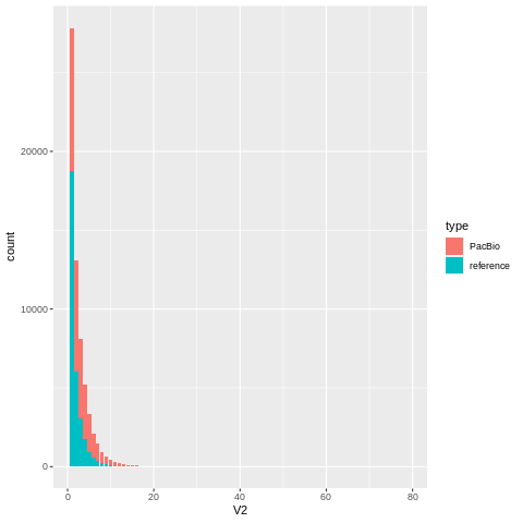
如果你同时含有两个样本的频数信息,需要针对不同的样本画不同的的柱子;只需要在数据框中添加一个字段即可。例如我的数据中含有PacBio测序数据和参考基因组数据两个文件
- PacBio
- regerence
1 | pacBioData<- read.table("PacBio文件") |
绘制直方图
x=V2表示x轴数据使用V2字段进行映射fill = type针对type字段使用不同颜色进行填充stat = "count"统计x轴中每个值出现的次数,用作柱子的高度
1 | library(ggplot2) |
调整
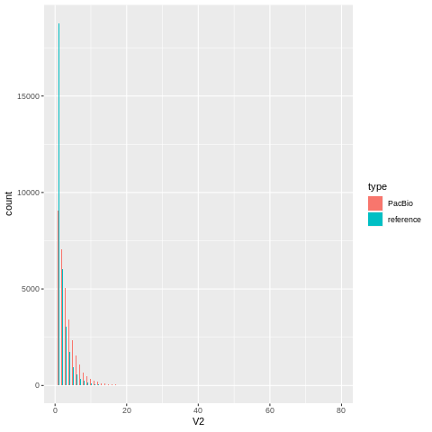
position = "dodge"将柱子调整为不堆积状态width = 0.5调整柱子宽度
这里由于x轴的坐标轴范围比较大,柱子缩放了看不清
1 | ggplot(data = mergeData, aes(x = V2, fill = type)) + |
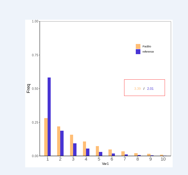
2.频率直方图
数据准备
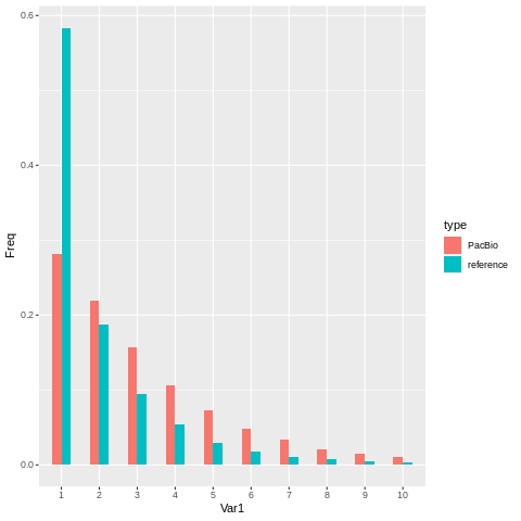
使用R中的table函数和prop.table函数计算频率
1 | PacBioFrequent <- as.data.frame(prop.table(table(pacBioData$V2)))[1:10, ] |
处理后的数据
1 | Var1 Freq type |
绘制图形
参数和之前的都是一样的
1 | ggplot(data = mergeData, aes(x =Var1, y=Freq,fill = type)) + |
3.美化图片
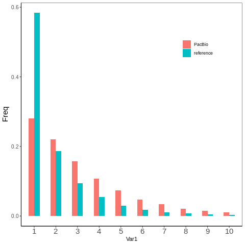
不涉及数据层的美化
- 图片背景色
- 图片网格
- 坐标轴刻度线
- 坐标轴刻度文字
- 坐标轴label文字
- 图例标题
- 图例位置
1 | p=ggplot(data = mergeData, aes(x =Var1, y=Freq,fill = type)) + |
自定义填充色
1 | p+ scale_fill_manual(values = c( |

调整柱子离坐标轴位置
这里我将柱子与x轴进行贴近,其他的可以类似
expand贴近坐标轴的位置limits设置显示的范围
1 | p+ scale_y_continuous(expand = c(0, 0), limits = c(0, 1)) |

添加自定义文字
通过使用geom_text函数,并且选择不继承原有的图片数据
data = labelData要显示的注释信息mapping指定显示的位置和字段inherit.aes是否继承图形数据,如果是使用自定义数据,这里一定要FALSE
1 | #将要展示的注释文字 |
参考
- CDSN博客